http://polycount.com/discussion/160866/starcraft-2-legacy-of-the-void-art-dump The quality of the assets (even minor doodads) is ages ahead if compared to WoL and still far ahead to SC2 HotS models... That's what i wanted! Great campaign with great assets and a good story (is not incredible as a story but way better of WoL or that garbage of hots) i am so gratueful that i will forgive the dumbass Epilogue Kerrigan Xelnaga stuff
heroes of the storm would be a disaster without that great art and character lore. The gameplay quality of that game is below average imo. Skills deal non-crucial damage and there are no means realy to show off player individual skill (like dodging direct spells in dota with dagger or bkb). The environment and character art there saving situation (the sky temple and hell vs heaven looks extremely polished). I think there is a big gap between art and gameplay quality in HOTS, i realy surprised major cybersport team owners built their bands for HOTS, i think it's mostly because there is not much to play despite dota in moba genre, and ofcourse mobas are most popular now. (or blizz just asked($) them? =)
Kind of a shame. When i got my beta i thought i would invest some time playing it. But it is so downgrade after dota i used to play. The art ofcourse is 100x times better, but gameplay is minimum 2x times worse and boring. People just don't get punished hard for their mistakes. Just spam your drab abilities that doesnt do shit and see who will die first (which will not going to happen quickly though). Lame ;(
I mean just try to rip off art assets from HOTS and see the bare bones of the gameplay. It sucks. Right now the game become more like a Blizz modelers showcase than actual game. The funny thing it still worth it cuz the art is super good XD
Imo it came to the point where game designers from Hots should give 40% of their salaries to SAM :D (just for the worshiping sake?) Lel
Mmmh, I have to disagree. Sure, in terms of quality the art in HOTS is superb.. but in terms of style? Imo, its just this super generic uninspired cartoon style that sucks the personality out of all the characters. Honestly, I kinda of really hate it, its so bland, I hate looking at it. Nothing in that game feels like it has any weight or substance to it.
i kinda like the style. In general case i prefer fantasy over sci-fi. it's all about preferences though. The skins meant just for sale and i dont count them in. Without them the game looks pretty much like wc4, if they would have released it nowadays.
And it shows, the lay-out is even more disorganized than your public transportation :D
Have to say though, that is one juicy model.
Your violence, young prodigal, is typical. As is your inablility to comprehend the greater scheme of things. This is only the tip of the iceberg, Italy is like a beautiful man so rotten inside to become a personification of disease itself, corruption, mafia, all the stereotypes... We totally deserve them, i was proud of a compatriot, not of that atrocity that is the country i live on.
Heroes of the Storm focuses on PvE mechanic and diversity on maps, the full meaning of the game is True team game, not lone wolf gameplay, or you cooperate or you are screwed, it for sure doesn't want to use the same map for 14 years or be a retarded WarCraft 3 wannabe :D (Lol valve game even has wc3 minigames that uses ported wc3 assets XDDDDDDD GG VALVE!)
Keep in mind that this game puts itself between WoW and WC3 style so some compromises had to be done, i love the style actually, the medic for example is gorgeous, the Butcher is 823704473294 times better of the Diablo 1 one and even better of the fat ass retarded diablo 3 one, i mean look at this, is simply HANDSOME!
He doesn't make differences between sex or color of the skin, he axept everyone, i love this old joke :D
Can you give me some example of over cartoony character? Thanks. Because SC and Diablo characters are all awesome imho, and even 99% of WarCraft ones, i mean did u see Sylvanas, she looks pretty as hell!
I hate Samwise's art style, which can only be described as cartoonish and juvenile. The fact that Blizzard games look like Warcraft 3 or a kid's cartoon is probably one of the main reason's I'm not interested in their products apart from StarCraft. I didn't mind when this effect was just restricted to Warcraft, but it was saddening to see StarCraft's art go from dark and semi-realistic, to every character being a bloated and clown-looking piece o' crap.
I hate Samwise's art style, which can only be described as cartoonish and juvenile. The fact that Blizzard games look like Warcraft 3 or a kid's cartoon is probably one of the main reason's I'm not interested in their products apart from StarCraft. I didn't mind when this effect was just restricted to Warcraft, but it was saddening to see StarCraft's art go from dark and semi-realistic, to every character being a bloated and clown-looking piece o' crap.
Please let's forget about Heart of the Swarm... It was an incident... A horrible incident
Why u don't like WC3 style? I find it awesome, is WoW style that is clownish, even if on the last year it seems to have gained some brain, i mean look at that warden, is good, except for the giant shoulderplates, sadly a trademark of wow ...
And how can you call clown the style of sc2? Artanis looks great, the HD mothership kicks ass, can you give me some example of cartoon style on sc2 ? The marine suite ? Kerrigan that looks like a slut? The zerg swarm looks perfectly fine, especially the ultralisk... Protoss is not elven like, especially with lotv
I prefer this style over the WH40K knock off that was sc1 under some circumstances... Hydralisk? SC1 Marine? Zergling? Do you remember?
Working on that Brood War Hydra has really got me down about the current art style. It used to be amazing and so unique among other games. It's hard to believe the guy who made that original ghost or zergling sketch in the manual also made that anime dragon thing...
If anything StarCraft 2 is the knockoff. The SC2 Marine looks so close to the Space Marine. The Zerg lost their identity as they once looked like organs and had individuality now they all have the exact same color pallet. The Protoss look way different but they feel right. Although the change of all of their heads is atrocious. Removed all individuality from them. Artanis is awesome but his armor belongs on a WarCraft character not a high tech alien.
There was something about that 90s style space that I think is more StarCraft than just WarCraft in space. Unfortunately now that's literally what they have. The story, style, characters and gameplay are just WarCraft now.
I love WarCraft by the way I just don't think the styles should mix.
Are you talking about the sc2 zergling and Hydralisk ? Generic design ?? Really??
Btw i prefer zerg over Tyranids aka Xenomorph on steroids, wooo mind blowing design... please... Or wh40k marines... All in this series to me looks like is desperately screaming "HEY! LOOK AT MY MASSIVE AND MANLY DK !"
And i know that WarCraft and SC were inspired by it and even ripped off a lot of things... But as i said before the sc2 style differentiate from warhammer and has a unique style imho...
I don't know, the bulkier sc2 marine ok... But the silouette of the sc1 marine... Is so warhammer...
About Artanis... Dude you must inform yourself, Artanis armor doesn't belong to a WarCraft character, there aren't definitely armor like his one on WarCraft, there are not and... there will never... dies chocked...
I don't hate all these new protoss heads, never liked BW toss potatoes heads, i prefer this Egypt style, did u see Kaldalis? He is simply badass... They now looks with actual aliens with a complex skull instead of "man-with-no-nose-and-mouth" potato faces :D
Mix WarCraft and StarCraft styles is bad, i agree... Luckily with Reaper of Souls the Diablo franchise regained his personality, and don't tell me that is still wow, there was not so much WoW on diablo 3 vanilla btw, it was mostly the lightning that was too bright on some locations, with light changes every locations changes drastically, try act 1 catacombs on campaign mode and on adventure mode and you will understand what i mean
With the Zerg they used to look like insects and their buildings were similar to piles of organs and meat. It was disgusting as the Zerg should be. You can see in the picture below they basically just added 400 spikes to everything and applied this extremely dull brown and purple to everything. On top of that the units look so cute. The lurker, zergling, baneling, overlord and infestor look straight out of Pokemon.
Going onto the Terrans you can see in the picture how dull the textures are. Everything is clean and looks straight out of a Megablocks pack. If I remember correctly they have a deal with Megablocks too. A few minutes in photoshop and it looks much closer to the original in my opinion.
I want to express again how much I love Artanis and he definitely deserves better armor than his shoulder pad in BW, but this picture proves they based it on a WarCraft character. In fact if I looked harder I'd probably even find something closer. From the general design to the shoulder pads and forearms it's the same. Looks like metal plates lay over each other instead of the techno suit the lower right zealot picture shows.
As far as the heads I like the new model design. What I was talking about is the colors. Characters had many different eye and skin colors. Not to mention patterns like Fenix, Tassadar and Aldaris. In SC2 you rarely see a Protoss with a different face.
All in all I still generally like SC2 but I'm way more of a fan of the good ol' days. This is all just my opinion.
Bhahaha you killed me with Pokemon zerg, so cute!!!!! Also Terran Megablocks ... Nnnoooooooooooooooooo... Now that i watch better the textures are dull indeed...
I don't really know about zerg, they still looks like insects, but they also look like reptilians, so we can throw away Tyranids a bit... And the structures looks like actual living beings instead of bags of flesh, they still looks like flesh imho, not so much, but they still do, the textures are worse, you got that right, but not try my Phillip Gonzalez, he did a great job with zerg on my opinion
I am so glad that Mr Jack is the art director of Blizzard, he is a better artist if compared to Samwise, even if i still love the powerful design of Samwise, like our new shiny Artanis
On the CGI the protoss looks damn sexy and techno, especially that horny probe, way better and believable of the sc1 zealot you posted, also the SM Mothership looks really techno, to me the protoss race improved a lot in terms of design, Artanis, Vorazun, our lord and savior Alarak (i still prefer Artanis as a Character), Rohana, they doesn't look like elven and the skulls are all different... Karax looks weird with the stone beard but it still looks fine, Zeratul simply went to the Gym (can we say that the nipples never existed?) and his armor is way more interesting of the BW one (even if it was similar to the LoK vampire one, they born on the same year :O), Lasarra has a different skull from the other protoss (and she has a navel... Goddamnit Blizzard! Goddamnit!) and Selendis has another different face and skull, the armor doesn't protect nothing and makes no sense to my eyes with Dat Ass and ribs exposed to enemy artillery or claws... At last the zealot game model that to me looks perfectly fine and near to the old design, even if he looks a bit "fat".
http://imgur.com/a/JIa1P Don't mind the angolations, i took these images the help with an image on deviantart
I hated all the deviations from a marine suit, the weird shoes and bell pants, and how it doesn't have mechanical arms or full legs to support all the weight, but hey, it's a chick so you gotta show some curves, right?
the Butcher is 823704473294 times better of the Diablo 1 one and even better of the fat ass retarded diablo 3 one, i mean look at this, is simply HANDSOME! He doesn't make differences between sex or color of the skin, he axept everyone, i love this old joke :D
And then you don't post a picture of his sexy butt.
The Zerg lost their identity as they once looked like organs and had individuality now they all have the exact same color pallet.
And strong chins plus those side jaws, just check Mr Jack's Torrasque and SC2 Ultralisk. I really don't mind the color palette being more uniform now, but having transparent insect wings on a dog-sized abomination and a rhino horn on a not-crypt king thing feels wrong in my opinion.
And I agree Artanis' armor feels weird, specially if you're playing on any of the two D3-themed maps in heroes and he totally fits the heaven side! I meant WTF? Give him a hood and hide his face and he's one of the angels. And before I forget: HIGH HEELS!
My general opinion is much like some here, the franchises are getting too alike each other and that's bad. Eventually warcraft and diablo classes will all have the same names and use the same abilities. Their wizards/sorcerers/whatever have the same "specializations"? I don't play these games but when I read that discussion on HotS forums I was shocked, it was about the available specialization for Li Ming being "arcane" since both frost and fire were already taken by Kael and Jaina, the discussion passes as totally normal if we forget we are talking about two different games.
Rollback Post to RevisionRollBack
To post a comment, please login or register a new account.
http://yongha88.blogspot.it/ That's simply impressive, congratz, and it's even an Italian site, so proud :)
yes Samwise is amazing and his art style is the main reason of Blizz game's success imo.
I am reall glad that Samwise and Mr Jack are following both sc2 and heroes of the storm
heroes of the storm would be a disaster without that great art and character lore. The gameplay quality of that game is below average imo. Skills deal non-crucial damage and there are no means realy to show off player individual skill (like dodging direct spells in dota with dagger or bkb). The environment and character art there saving situation (the sky temple and hell vs heaven looks extremely polished). I think there is a big gap between art and gameplay quality in HOTS, i realy surprised major cybersport team owners built their bands for HOTS, i think it's mostly because there is not much to play despite dota in moba genre, and ofcourse mobas are most popular now. (or blizz just asked($) them? =)
Kind of a shame. When i got my beta i thought i would invest some time playing it. But it is so downgrade after dota i used to play. The art ofcourse is 100x times better, but gameplay is minimum 2x times worse and boring. People just don't get punished hard for their mistakes. Just spam your drab abilities that doesnt do shit and see who will die first (which will not going to happen quickly though). Lame ;(
I mean just try to rip off art assets from HOTS and see the bare bones of the gameplay. It sucks. Right now the game become more like a Blizz modelers showcase than actual game. The funny thing it still worth it cuz the art is super good XD
Imo it came to the point where game designers from Hots should give 40% of their salaries to SAM :D (just for the worshiping sake?) Lel
And it shows, the lay-out is even more disorganized than your public transportation :D
Have to say though, that is one juicy model.
Mmmh, I have to disagree. Sure, in terms of quality the art in HOTS is superb.. but in terms of style? Imo, its just this super generic uninspired cartoon style that sucks the personality out of all the characters. Honestly, I kinda of really hate it, its so bland, I hate looking at it. Nothing in that game feels like it has any weight or substance to it.
That SM Mothership though... really awesome.
@Crainy: Go
i kinda like the style. In general case i prefer fantasy over sci-fi. it's all about preferences though. The skins meant just for sale and i dont count them in. Without them the game looks pretty much like wc4, if they would have released it nowadays.
-
View User Profile
-
View Posts
-
Send Message
Curse PremiumIt is indeed all about preferences. I can't say I agree that heroes has bad gameplay or a bad art style.
Either way though, that mothership looks incredible. I'll have to check into it more later.
-
View User Profile
-
View Posts
-
Send Message
Curse PremiumI honestly like the moba lite approach to hots. To each their own and shit.
Go play Antioch Chronicles Remastered!
Also, coming soon, Antioch Episode 3: Thoughts in Chaos!
Dont like mapster's ugly white? Try Mapster's Classic Skin!
Your violence, young prodigal, is typical. As is your inablility to comprehend the greater scheme of things. This is only the tip of the iceberg, Italy is like a beautiful man so rotten inside to become a personification of disease itself, corruption, mafia, all the stereotypes... We totally deserve them, i was proud of a compatriot, not of that atrocity that is the country i live on.
@abvdzh: Go
Heroes of the Storm focuses on PvE mechanic and diversity on maps, the full meaning of the game is True team game, not lone wolf gameplay, or you cooperate or you are screwed, it for sure doesn't want to use the same map for 14 years or be a retarded WarCraft 3 wannabe :D (Lol valve game even has wc3 minigames that uses ported wc3 assets XDDDDDDD GG VALVE!)
@Crainy: Go
Keep in mind that this game puts itself between WoW and WC3 style so some compromises had to be done, i love the style actually, the medic for example is gorgeous, the Butcher is 823704473294 times better of the Diablo 1 one and even better of the fat ass retarded diablo 3 one, i mean look at this, is simply HANDSOME!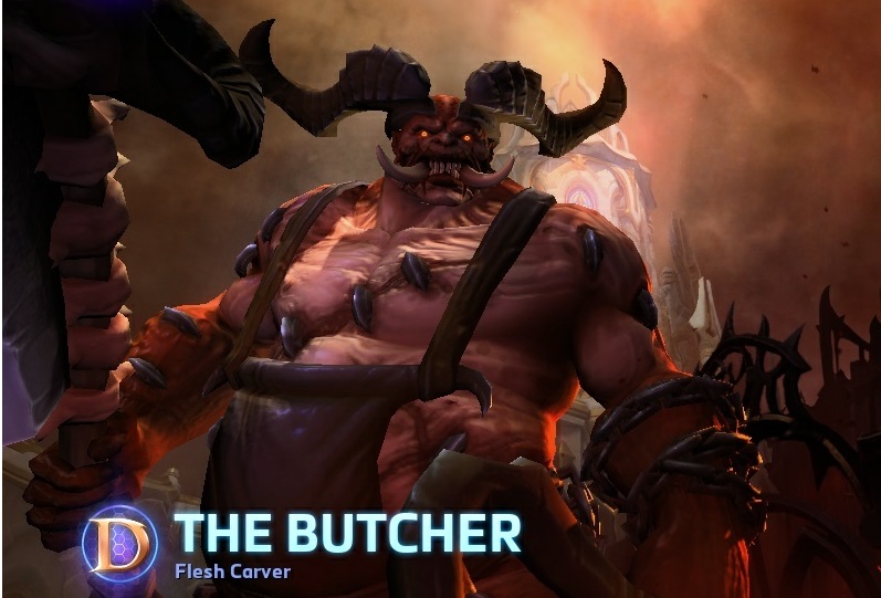 He doesn't make differences between sex or color of the skin, he axept everyone, i love this old joke :D
-
View User Profile
-
View Posts
-
Send Message
Curse PremiumI hate Samwise's art style, which can only be described as cartoonish and juvenile. The fact that Blizzard games look like Warcraft 3 or a kid's cartoon is probably one of the main reason's I'm not interested in their products apart from StarCraft. I didn't mind when this effect was just restricted to Warcraft, but it was saddening to see StarCraft's art go from dark and semi-realistic, to every character being a bloated and clown-looking piece o' crap.
Zurvan for example looks like he belongs in Dora the Explorer, not StarCraft: http://vignette3.wikia.nocookie.net/starcraft/images/7/7d/Zurvan_SC2-HotS_Art1.jpg/revision/latest?cb=20130418231534
Please let's forget about Heart of the Swarm... It was an incident... A horrible incident
-
View User Profile
-
View Posts
-
Send Message
Curse Premium@Gradius12: Go
Working on that Brood War Hydra has really got me down about the current art style. It used to be amazing and so unique among other games. It's hard to believe the guy who made that original ghost or zergling sketch in the manual also made that anime dragon thing...
-
View User Profile
-
View Posts
-
Send Message
Curse Premium@DEFILERRULEZ: Go
If anything StarCraft 2 is the knockoff. The SC2 Marine looks so close to the Space Marine. The Zerg lost their identity as they once looked like organs and had individuality now they all have the exact same color pallet. The Protoss look way different but they feel right. Although the change of all of their heads is atrocious. Removed all individuality from them. Artanis is awesome but his armor belongs on a WarCraft character not a high tech alien.
There was something about that 90s style space that I think is more StarCraft than just WarCraft in space. Unfortunately now that's literally what they have. The story, style, characters and gameplay are just WarCraft now.
I love WarCraft by the way I just don't think the styles should mix.
Are you talking about the sc2 zergling and Hydralisk ? Generic design ?? Really??
I heard you were talking shit about SPACE MEEREENES?!
Yeah i did, now please move away that foken laser gun from my face... Thanks
-
View User Profile
-
View Posts
-
Send Message
Curse PremiumWith the Zerg they used to look like insects and their buildings were similar to piles of organs and meat. It was disgusting as the Zerg should be. You can see in the picture below they basically just added 400 spikes to everything and applied this extremely dull brown and purple to everything. On top of that the units look so cute. The lurker, zergling, baneling, overlord and infestor look straight out of Pokemon.
Going onto the Terrans you can see in the picture how dull the textures are. Everything is clean and looks straight out of a Megablocks pack. If I remember correctly they have a deal with Megablocks too. A few minutes in photoshop and it looks much closer to the original in my opinion.
I want to express again how much I love Artanis and he definitely deserves better armor than his shoulder pad in BW, but this picture proves they based it on a WarCraft character. In fact if I looked harder I'd probably even find something closer. From the general design to the shoulder pads and forearms it's the same. Looks like metal plates lay over each other instead of the techno suit the lower right zealot picture shows.
As far as the heads I like the new model design. What I was talking about is the colors. Characters had many different eye and skin colors. Not to mention patterns like Fenix, Tassadar and Aldaris. In SC2 you rarely see a Protoss with a different face.
All in all I still generally like SC2 but I'm way more of a fan of the good ol' days. This is all just my opinion.
Bhahaha you killed me with Pokemon zerg, so cute!!!!! Also Terran Megablocks ... Nnnoooooooooooooooooo... Now that i watch better the textures are dull indeed...
I hated all the deviations from a marine suit, the weird shoes and bell pants, and how it doesn't have mechanical arms or full legs to support all the weight, but hey, it's a chick so you gotta show some curves, right?
And then you don't post a picture of his sexy butt.
And strong chins plus those side jaws, just check Mr Jack's Torrasque and SC2 Ultralisk. I really don't mind the color palette being more uniform now, but having transparent insect wings on a dog-sized abomination and a rhino horn on a not-crypt king thing feels wrong in my opinion.
And I agree Artanis' armor feels weird, specially if you're playing on any of the two D3-themed maps in heroes and he totally fits the heaven side! I meant WTF? Give him a hood and hide his face and he's one of the angels. And before I forget: HIGH HEELS!
My general opinion is much like some here, the franchises are getting too alike each other and that's bad. Eventually warcraft and diablo classes will all have the same names and use the same abilities. Their wizards/sorcerers/whatever have the same "specializations"? I don't play these games but when I read that discussion on HotS forums I was shocked, it was about the available specialization for Li Ming being "arcane" since both frost and fire were already taken by Kael and Jaina, the discussion passes as totally normal if we forget we are talking about two different games.